News Next article
How to design high-performing display ads - As a designer
When it comes to display ads, Trade Me has over a decade’s worth of data on what works in NZ and what doesn’t
By Iris Wood 5 April 2019
When it comes to display ads, Trade Me has over a decade’s worth of data on what works in NZ and what doesn’t. In 2018, we loaded 9,300 creative assets on-site and served ads to 1.8 million active members¹. Below, I’ve illustrated a handful of the trends that emerged to help you make even better creative.
Our findings support the theory that’s been peddled by online publishers since the turn of the century: for a campaign that smashes all it’s KPIs, you need both excellent targeting and thoroughly considered creative assets. One particularly extensive study² concluded that the “creative quality” of online ads is 50-75% responsible for a campaign’s success or failure. Long story short, campaigns with second-rate creative will probably remain disadvantaged, no matter how smart or granular the targeting is.
Clearly, it’s in everyone’s best interests to ensure the creative assets have a fighting chance before they get served in front of any audience. Nowadays, many users are desensitised to cluttered, uninteresting or intrusive creative from years of being served it³. While that probably sounds daunting to marketers and designers alike, it means that the opportunities for experimentation and data-driven improvement are massive.
Design principles for high-performing display
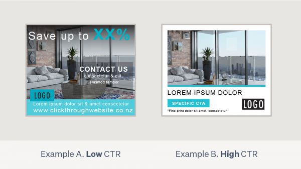
Below are four ads (MRecs) that have been re-created with placeholder text and images to show the different design treatments. The two on the left performed poorly and the two on the right were high-performers.

Design principle 1. Simplified key messages.
The low-performing ads, example A and C, had 21 and 22 words in total (excluding logos, fine print and symbols); the high-performing ads, example B and D, had only 5 and 13.
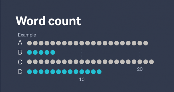
This is the first principle because it’s the most important thing to get right. No design finesse will be able to correct the disadvantage of shoehorning too much copy/too many distinct messages in a display ad. There are a number of studies showing a direct correlation with the number of key messages in an ad and a declined rate of communication and retention⁶. Make sure whoever is writing the ads knows the value of a short, enticing and legible message; because the more they say, the less will be heard.
Design principle 2. Space around elements/frames.
Both high-performing examples have big frames, which our eyes are naturally attracted to. While you don’t need a graphic frame in every display ad you make, you do need to have an ample amount of space around the elements within the ad. In example A, The logo is touching a text box and a lot of the type is dangerously close to the edge. This all contributes to poor legibility and a confusing hierarchy.
Design principle 3. Legibility is paramount.
One of the reasons example A didn’t perform well was the text-on-image approach, which resulted in very poor legibility of most text. While having your text on an image can work, this is a good example of when it won’t. The photograph distracts from the text instead of supporting it. When designing display ads, I recommend keeping your smallest text above 14pt (excluding fine print) and checking that the contrast between your text and its background passes at least “Text AA” levels. A good level of text contrast is the first step towards ensuring the maximum amount of consumers will be able to read your message easily. You can check this here. The examples below show the nuance between great (AAA) contrast levels, good (AA) contrast levels and failing to meet the standard in headlines and normal text.
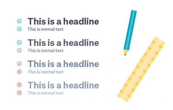
Legibility is one aspect of “Accessible Design” which is now a crucial consideration in product design. However, using accessibility principles when designing online ads means you’re not only designing with visual impairments in mind, but you’ll be achieving the highest possible “ease of reading” standard.
Design principle 4. Clear, considered logo.
The size and position of the logo are some of the most important things to consider when designing native ads. While the research about the position of the logo is polarising, many sources agree that the logo does need to be one of the most prominent elements, usually secondary only to the headline.
Design principle 5. Hierarchy.
In the low-performing examples, there’s apparent confusion about which messages are the most important. In the high-performing examples, the most important messages occupy the most space and have bright pops of colour. Hierarchy is a valuable tool to use when you’re working with a bit more copy than you might like. In the high-performing example D, the most important copy is a far bigger, bolder font and the less integral copy takes a back-seat due to it’s lighter graphic treatment.
Design principle 6. Buttons should look like buttons.
If you’re going to have buttons, make sure they look like buttons. Instead of having a button, example C has an underlined, generic CTA, which doesn’t look as credible or command as much visual attention.
Design and the buyer journey: why it shouldn’t be an afterthought
Many of our findings about the ads run on our site (and our broader research about display ads) highlight that effective creative starts with an adequate understanding of the buyer’s journey. Naturally, marketers change the way they talk to consumers that have never heard of our brand, vs those who have shown a strong intent to purchase in the past but haven’t followed through. However, the buyer journey isn’t considered often enough when it comes to the design of display ads. This prevents many campaigns from achieving their KPIs, let alone returning great CTRs or post-impression traffic.
At Trade Me, we use a simplified buyer journey model to structure the targeting we run onsite. This way, we can influence the consumer at each stage of their path to purchase.
This happens in three stages, all based on user behaviour. ‘Awareness’ is first, which targets members who have recently browsed within a category. This is the opportunity to reach this audience in the early stages of a specific path to purchase. The ‘Interest’ layer is second, reaching an audience that are further progressed along the path to purchase, having demonstrated behaviours that suggest they are most likely interested in purchasing/converting. For example, a higher number of listing views in a category. Lastly, the ‘Intent’ layer is when the member is closest to purchasing or converting, for example, they’ve started watchlisting items.
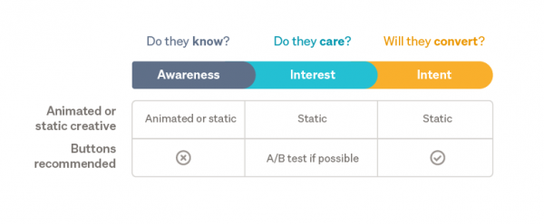
This diagram shows the two main design elements that should receive different treatments depending on which layer of the audience you are trying to reach. For example, now that a majority of users across multiple generations are familiar with display ads and their formats, there are many instances where you can get away without having buttons in your creative assets. Most users know that display ads are entirely clickable, whether or not they have a button.
For the audience sitting in the awareness layer of the funnel, buttons are less necessary and may, in fact, detract from the message you’re trying to convey. After all, when you’re trying to generate an audience’s awareness, the relevance of clicks doesn’t stand up to the relevance of other metrics. Reach and ushering the maximum amount of consumers into the next stage of the funnel should be the most immediate priorities of a campaign, so make sure your creative reflects this.

With all that said, distinct buttons can have a positive influence on click-through rates (CTRs), especially when there’s a uniquely appealing call to action (CTA)⁷. So, for the Intent Audience (that sits in the middle of the buyer journey), I suggest A/B testing creative versions with and without buttons.
Similar thinking applies to the “static vs animated creative” debate. For the awareness audience, subtle animations can be effective in capturing a curious audience’s attention, thus resulting in a degree of awareness. However, we’ve seen that static assets tend to outperform animated ones⁸ when it comes to standard campaign metrics, so if you’re talking to a more engaged audience (interest/intent stages), it makes sense to design your creative to be as easy to click as possible. No moving information, no appearing CTAs and no design “fluff”. This audience is either figuring out what they want, or they already know. Why make it difficult for them to get the message and progress through your buyer journey, or even better, convert?
Conclusion
Creating a full set of display ads for a campaign can be an overwhelming task because of the many considerations that shouldn’t be overlooked. I’ve highlighted the design treatments that have a track record of hindering a campaign’s performance, and the treatments that can help your creative assets become star performers. So, here’s to creating stellar creative that honours the six design principles above. Then we get to our end of the deal, which is making sure those assets are put in front of the right people, at the right time. If you’ve got questions about our approach or the different ads we offer onsite, please check out our media kit, chat to your account manager or flick us an email here.
²Ad Age - Online Ads Not Working For You? Blame The Creative
³Kantar Millward Brown - AdReaction global consumer survey 2017
⁴Trade Me - Ad Ops Database
⁵AdRoll - Creative Display Ads: Small Changes for a Big Impact
⁶Kantar Millward Brown - Global Database
⁷AdRoll - Creative Display Ads: Small Changes for a Big Impact
⁸Trade Me - Google Ad Manager data
Author